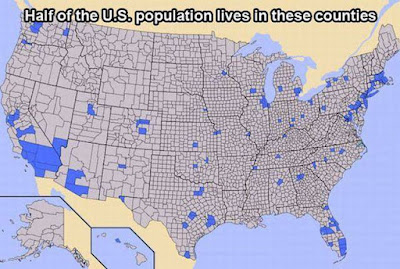
I just ran across this map of 'expensive' vs. 'inexpensive' places to live.
It reminded me of another map, where 'half' the US population lives (big cities). They look very similar.
Then I recalled what the mid-term 2014 election map looked like (take the House for example, where every seat was up for grabs).
It's easy to 'see' that big cities are more expensive places to live. But looked at through the lens of 'more government' vs. 'less government' (how intrusive the government is in your life) something else appears.
- Given that Democrats control the big cities (half the population) then: expensive + big cities + more government = Democrats (C).
But connect your own dots.....


1 comment:
theo:
i've copied and linked this at my blog. it quite simply portrays truth in a way that all the blabbering in the world cannot.
john jay
Post a Comment